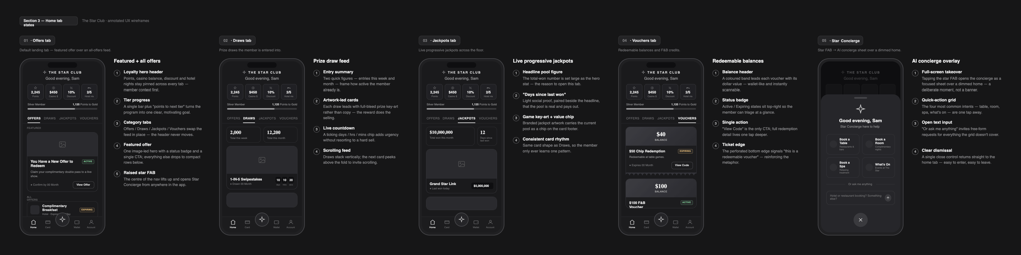
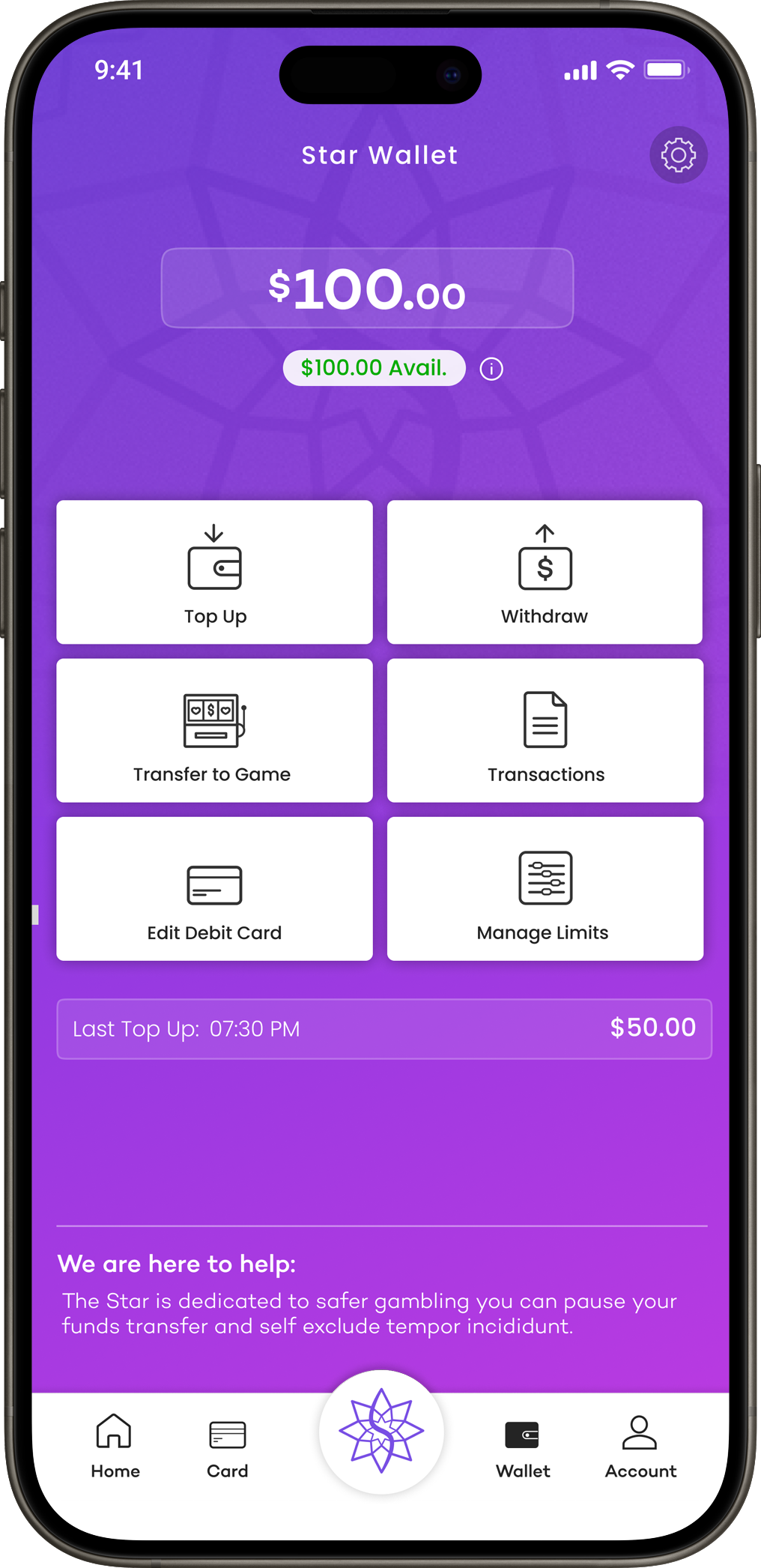
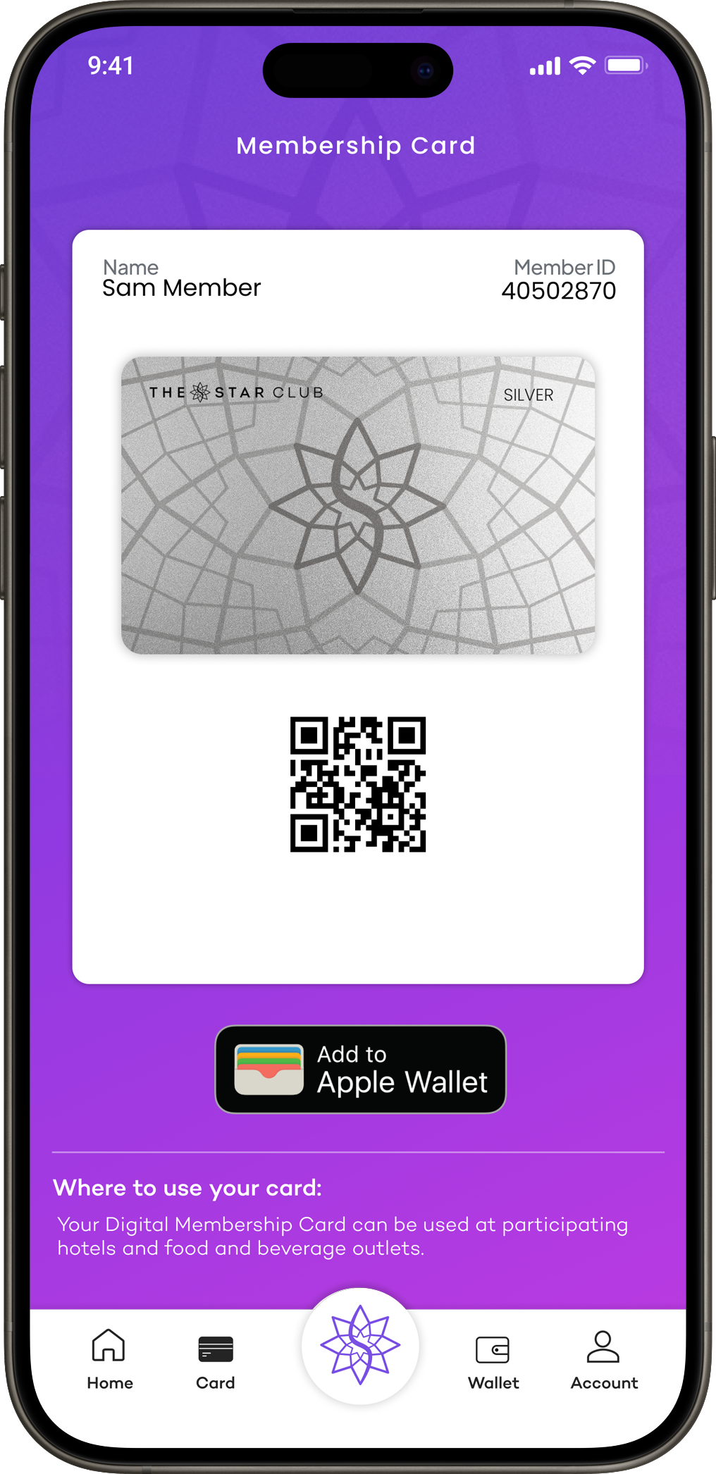
Low-Fidelity Wireframes
— Option 1
Low-Fidelity Wireframes
— Option 2
UX Design Assessment
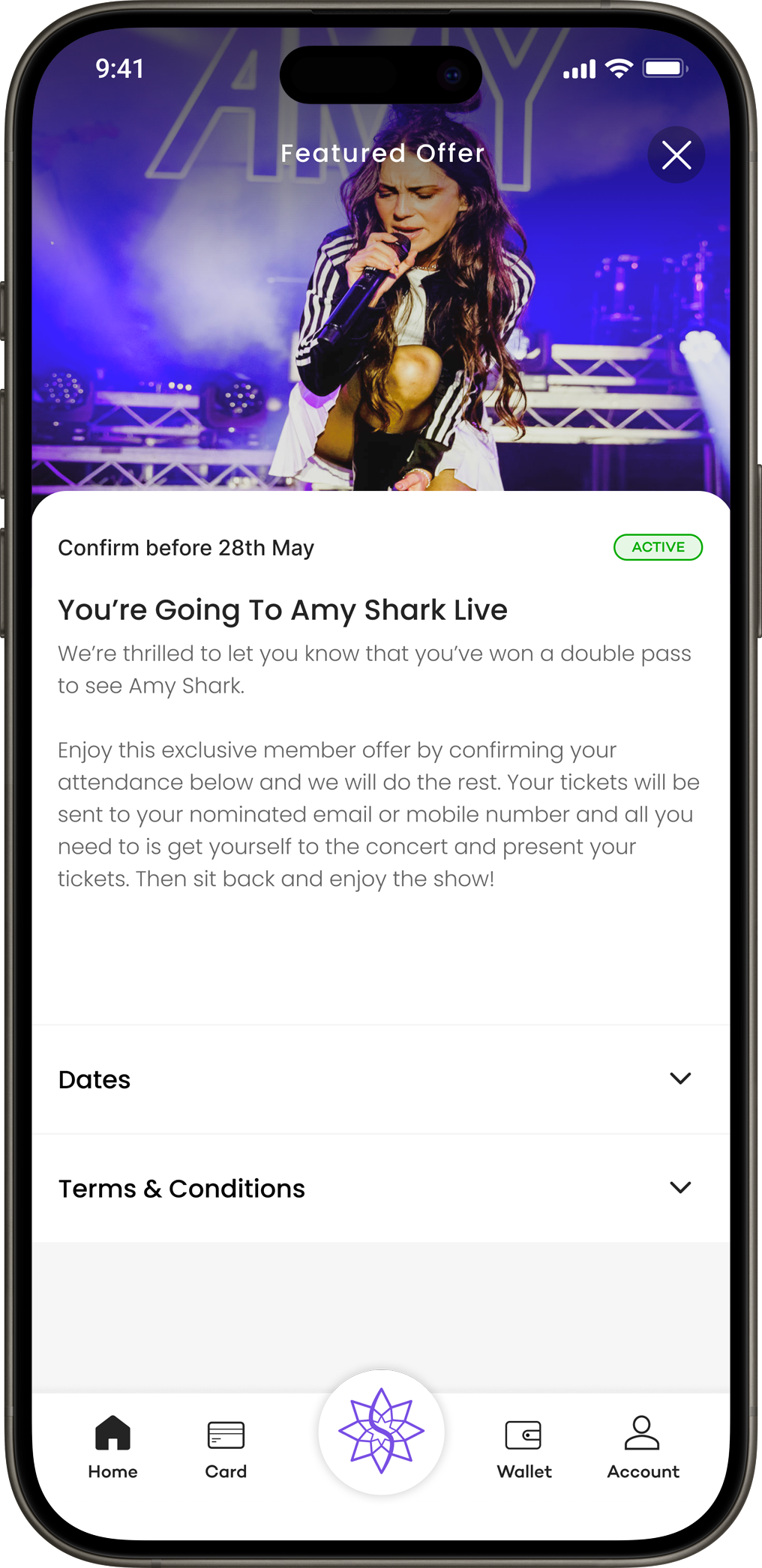
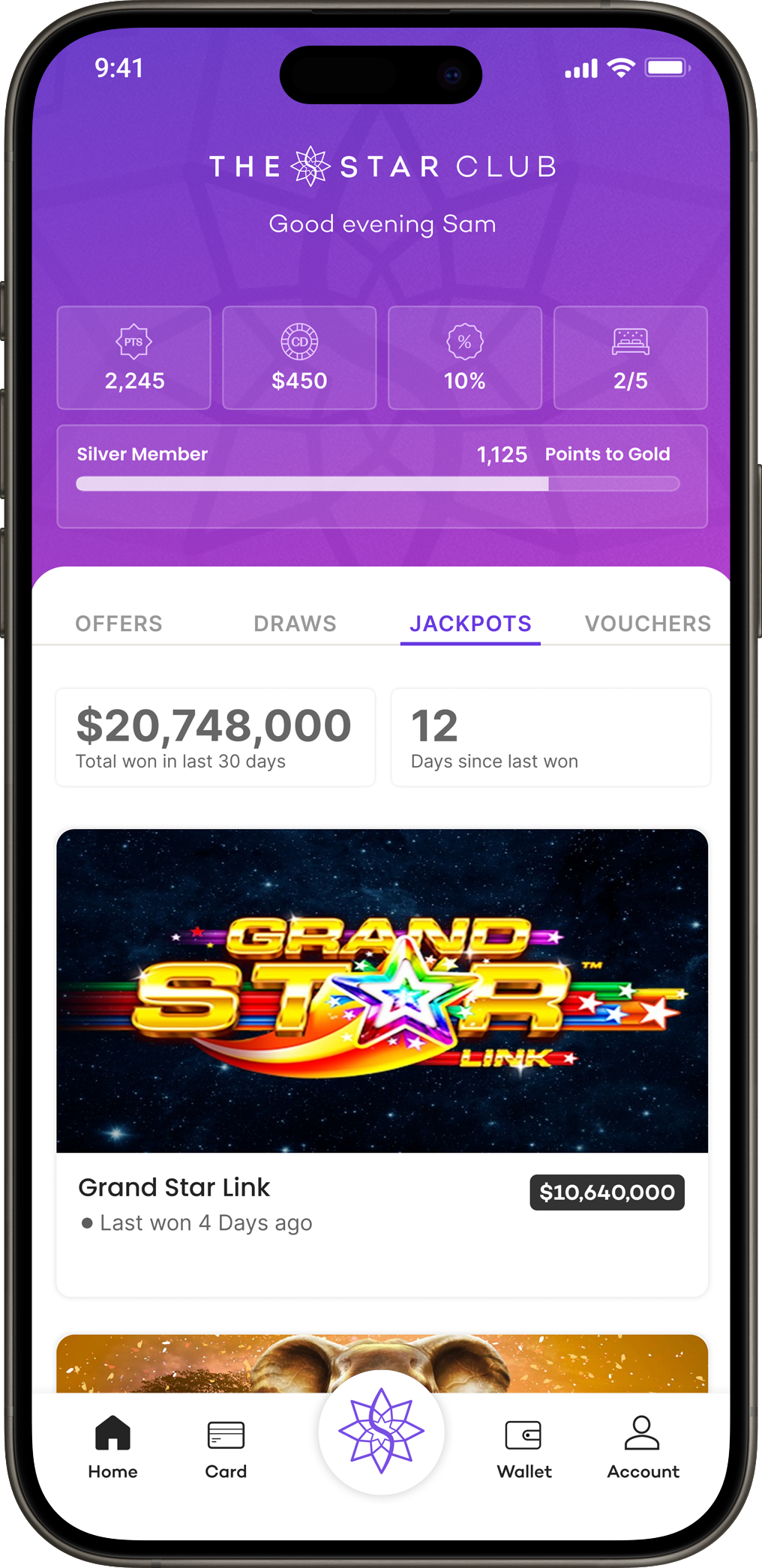
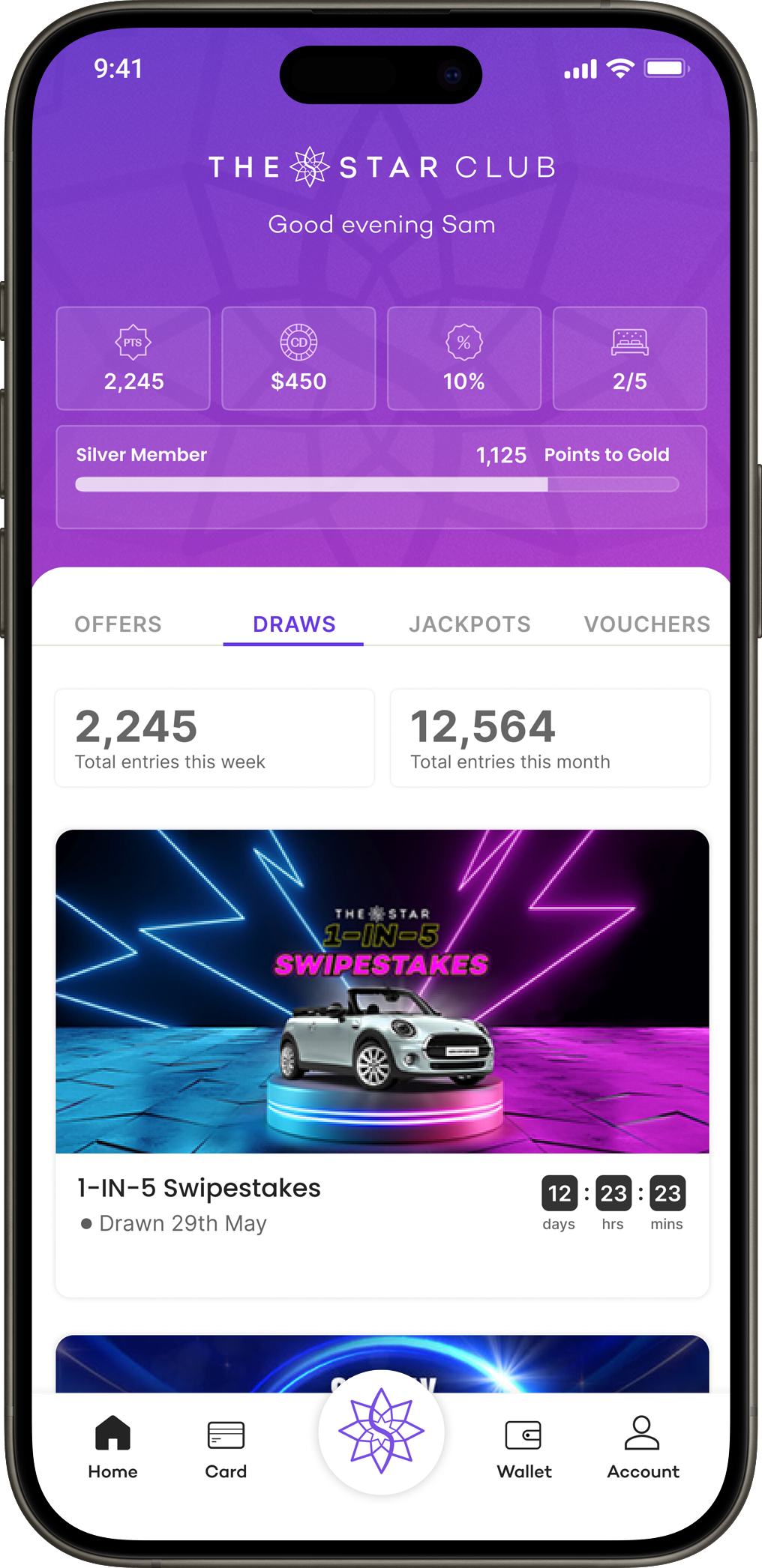
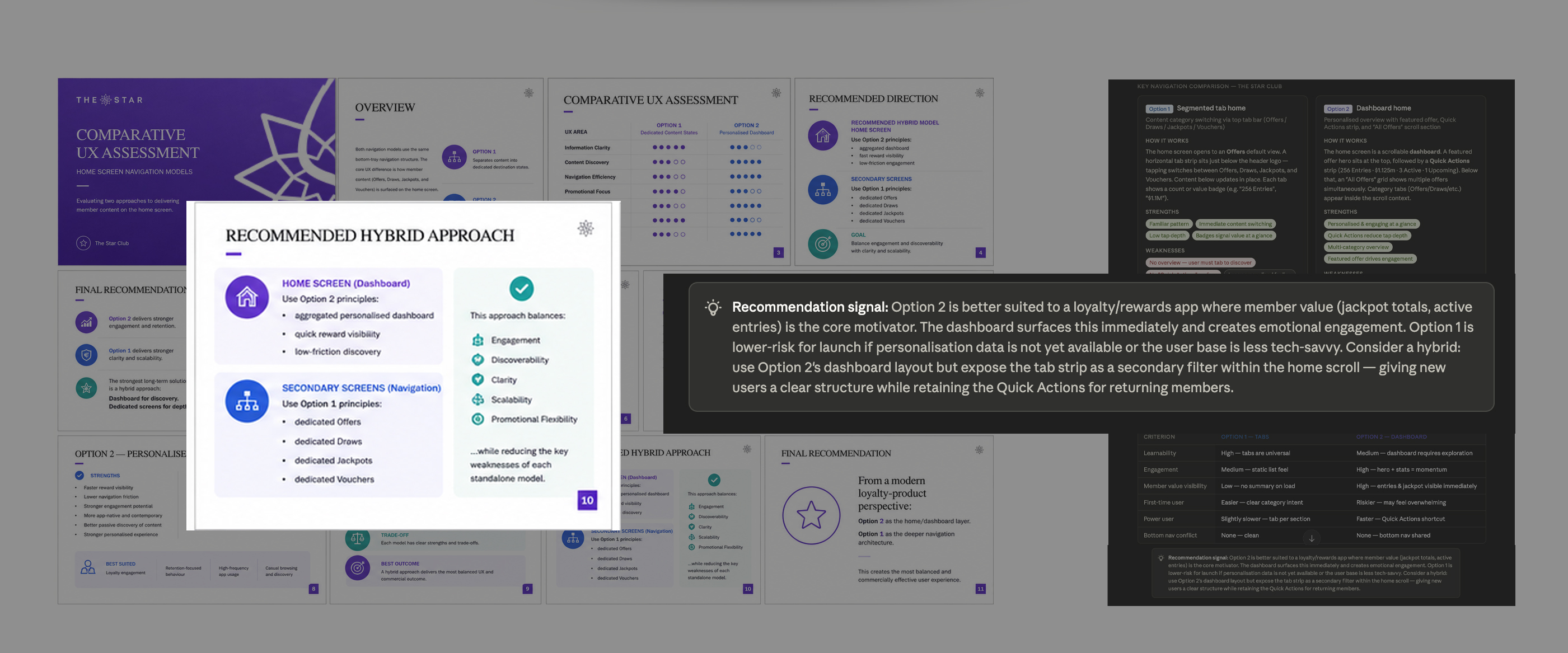
Both navigation concepts were evaluated through user testing and AI-assisted UX analysis. Option 2 consistently emerged as the stronger solution for loyalty-focused interactions, performing better in content discovery and engagement. While Option 1's tabbed navigation pattern tested well and offered greater simplicity, it was ultimately integrated into the final design.
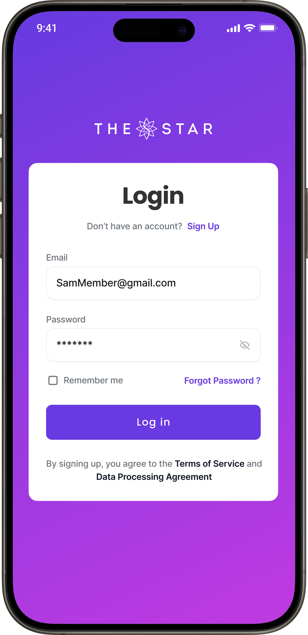
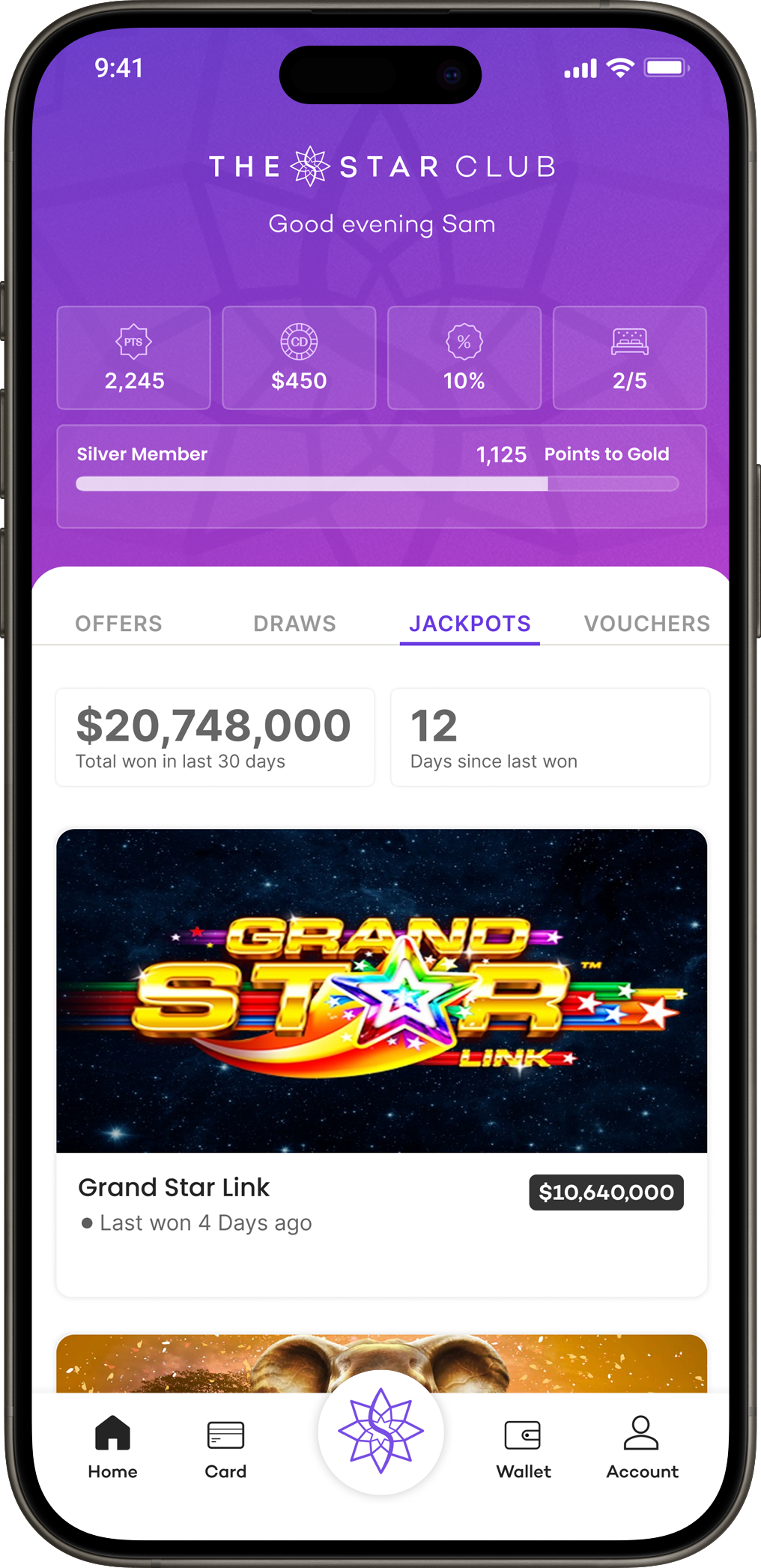
Hi-Fidelity Wireframes
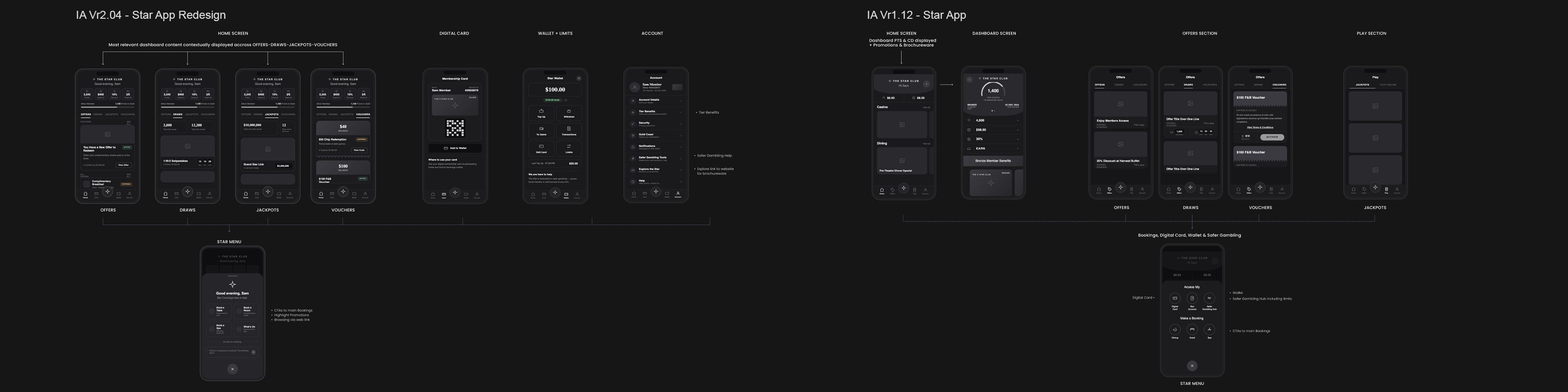
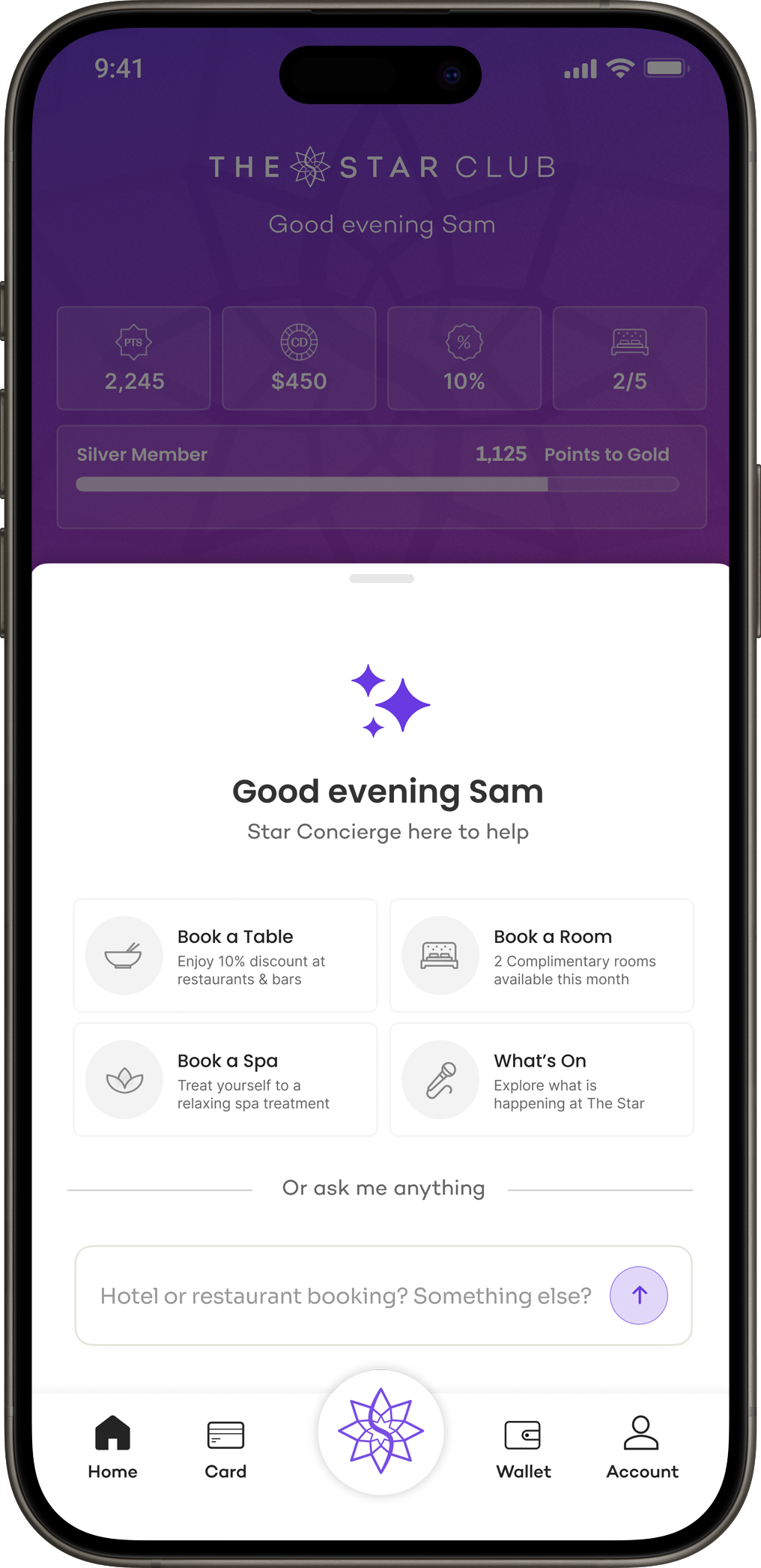
Updated high-fidelity wireframes were developed from the UX assessment findings, and revised navigation flows were used to compare the proposed information architecture with the existing app. The redesign also introduced an AI-powered assistant, envisioned as the primary entry point for key member interactions, including bookings, promotions, and content discovery.