Concept Project

ArchiFinder Platform Design.

Scroll
Project
A web platform for discovering architecturally significant buildings across cities worldwide.
Role
UX Research
Product Design
AI-Assisted Development
Platform
Web Platform
Desktop & Mobile
Deliverables
UX Strategy
UI Design
Clickable POC

01 — Where We Started

The Challenge
& Objectives

The architecture discovery space was missing a product that balanced visual inspiration with educational functionality. ArchiFinder was designed to bridge the gap.

The Challenge

Create an experience immersive enough to inspire casual browsers, while offering the research depth needed by students and professionals.

The Objectives

Create the go-to platform for architectural discovery — one that makes finding and exploring significant buildings as inspiring as the buildings themselves.

02 — UX Discovery

UX Discovery
& Research

The discovery phase covered audience research, competitive analysis, user flow mapping, and design direction — establishing the strategic and visual foundations for the platform.

Phase 01
Audience Research
Mapped motivations and behaviours across casual, enthusiast, student, and industry user groups.
Phase 02
Competitive Analysis
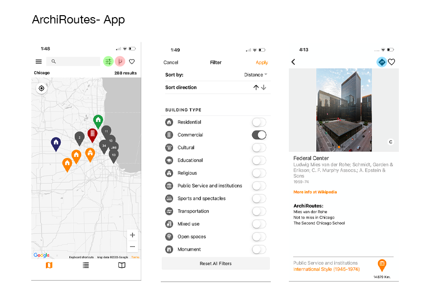
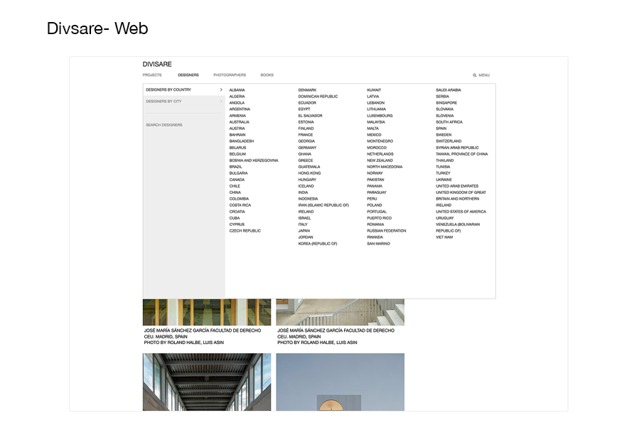
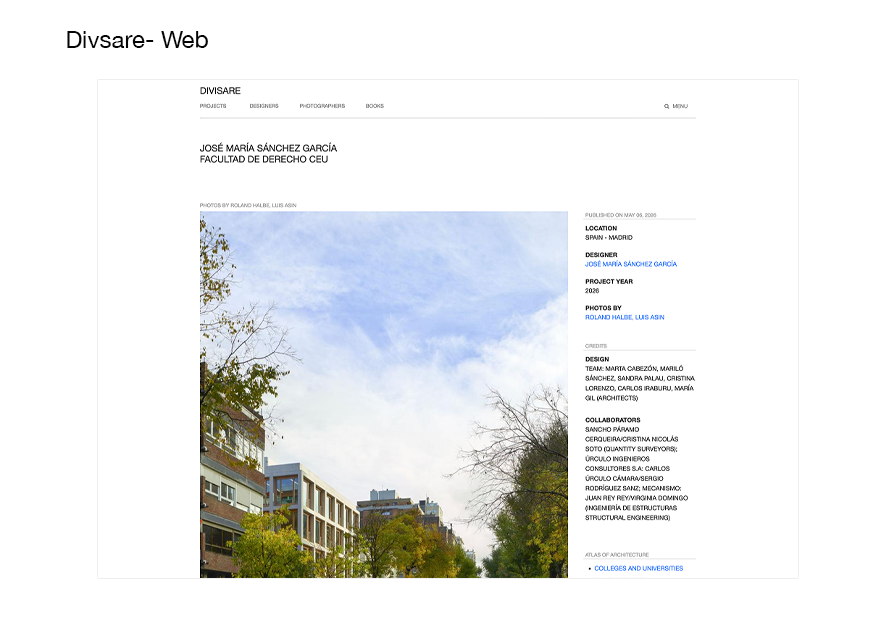
Identified a clear gap between refined industry tools and educationally-focused consumer apps — most of which were native apps rather than open web platforms.
Phase 03
User Flow Mapping
Mapped two primary use cases to define the core product experience.
Phase 04
Design Direction
Established a distinct visual language to differentiate the product in a crowded space.

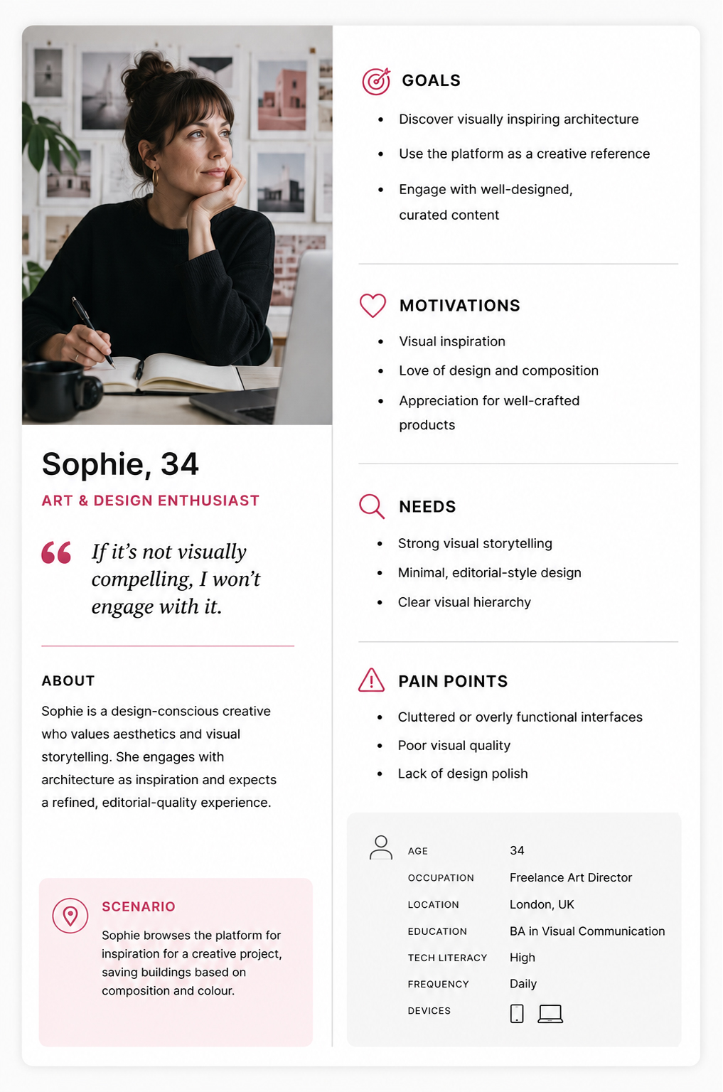
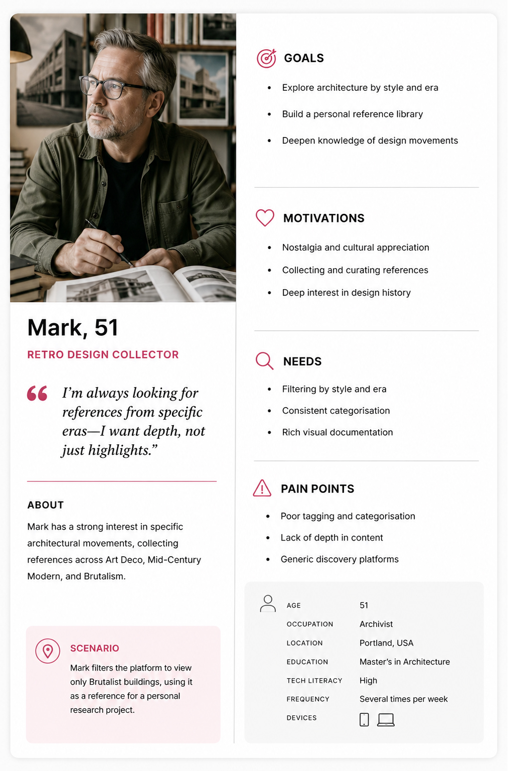
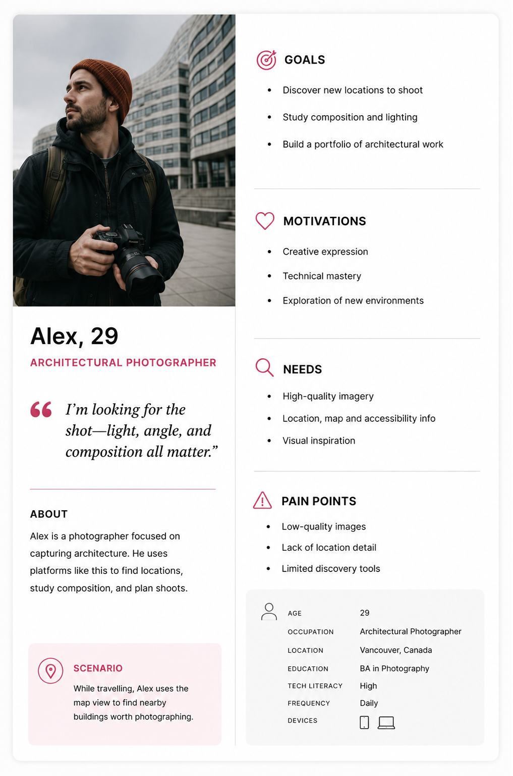
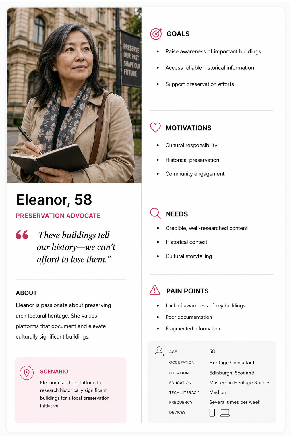
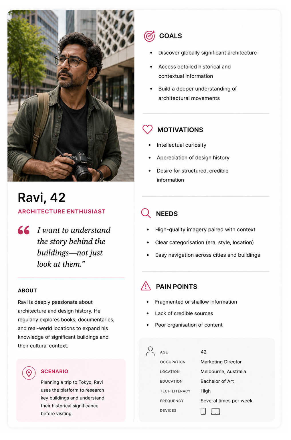
User Personas

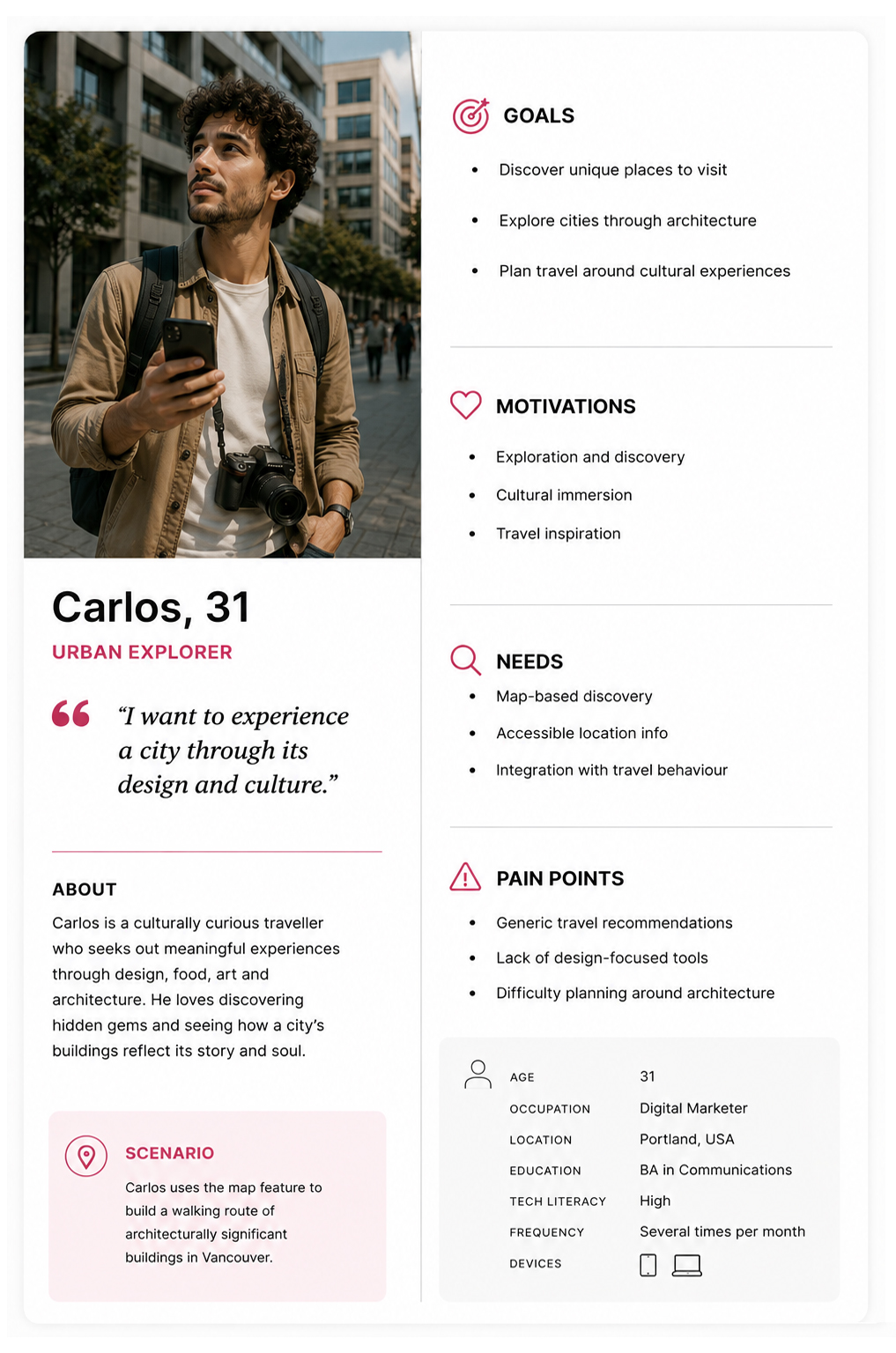
Six personas captured the full breadth of user motivations and discovery behaviours.
Persona 1
Persona 2
Persona 3
Persona 4
Persona 5
Persona 6
Drag to explore

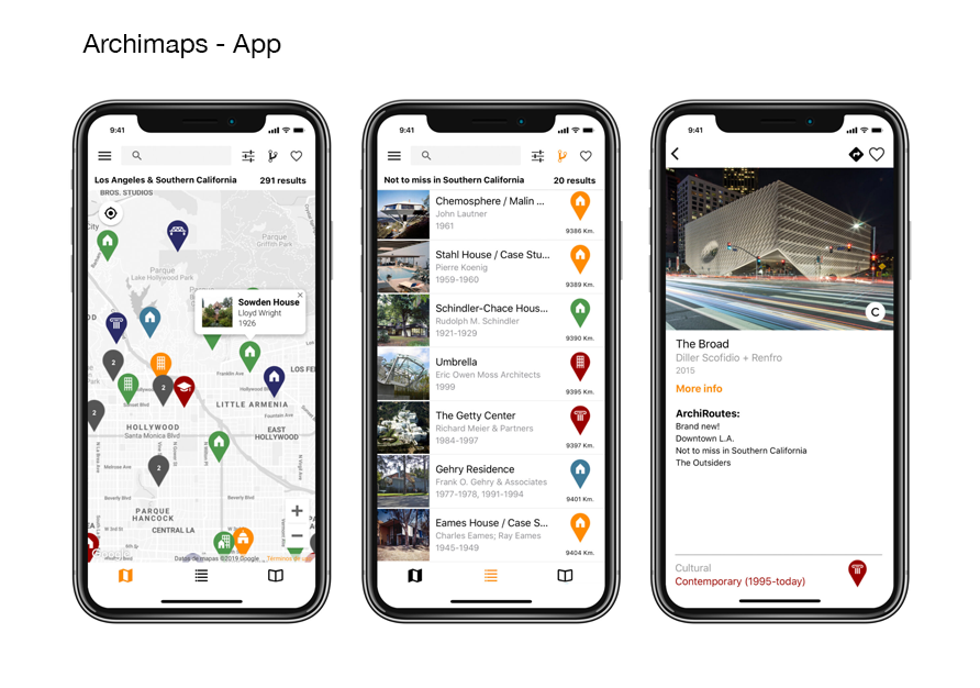
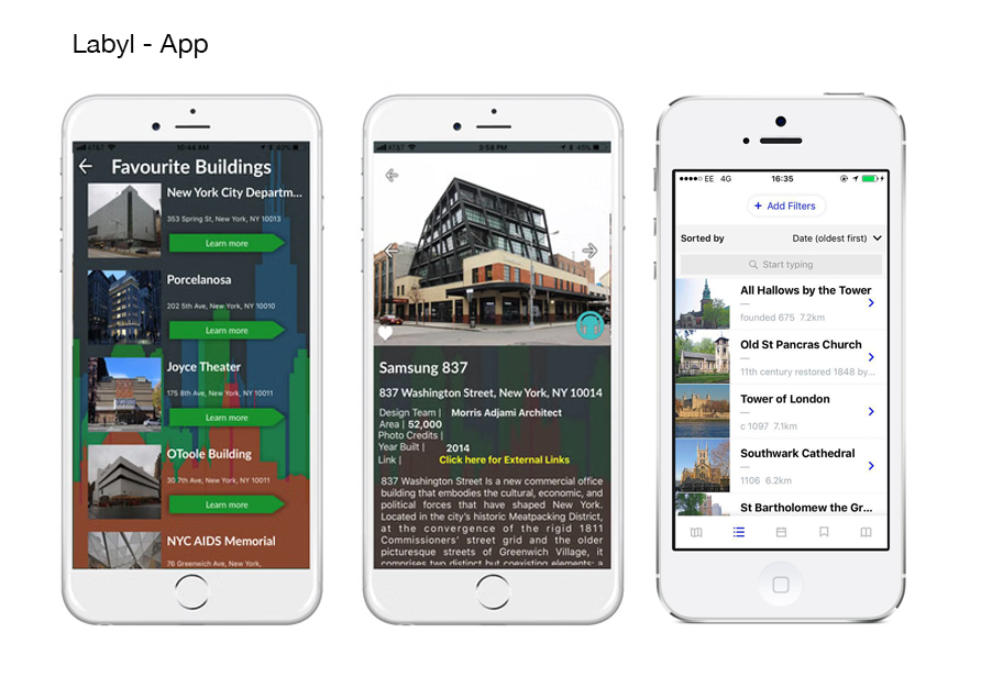
Comparative Research

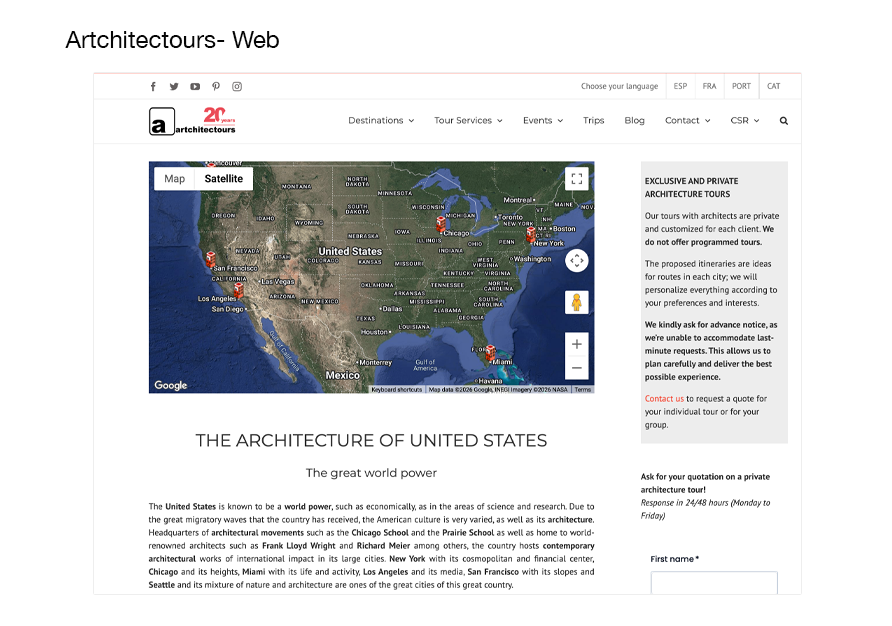
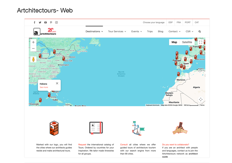
Industry products were refined but their content wasn't relevant to casual users, while consumer products were educationally focused but lacked visual polish — confirming the opportunity for a design-led product that served both.
Competitive Comparison 1
Competitive Comparison 2
Competitive Comparison 3
Competitive Comparison 4
Competitive Comparison 5
Competitive Comparison 6
Competitive Comparison 7
Drag to explore

03 — High Fidelity

Built in
Google AI Studio

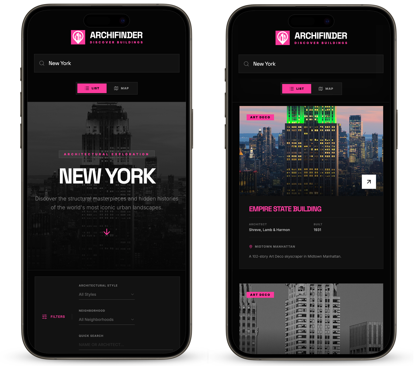
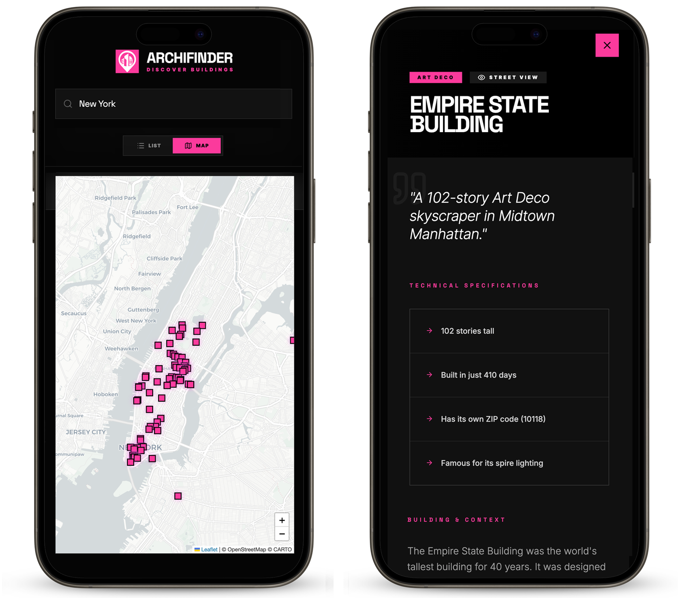
The high-fidelity UI was built and iterated directly within Google AI Studio — translating the design direction into a fully functional web platform. The result was a clickable, navigable product that demonstrated the full experience across both list and map views, ready for stakeholder review and user testing.

Clickable Prototype — List & Map Views

The POC demonstrated core user journeys across both discovery modes — browsing architecturally significant buildings by city, filtering by style or architect, and drilling down into detailed building profiles without leaving the page.

High-Fidelity Screens

Final UI screens across the core platform views — the homepage discovery feed, map exploration mode, building detail page, and filtered search results.

ArchiFinder High Fidelity Screens A
ArchiFinder High Fidelity Screens B

04 — Where We Landed

Project
Outcomes

ArchiFinder demonstrated that architecture discovery could be both visually ambitious and a genuinely useful research tool — delivered as an open web platform.

↑ Delivered
Exploration & Usability
Delivered intuitive navigation between list and map views, supporting both structured search and exploratory browsing within a clean, contemporary interface.
↑ Enabled
Content Accessibility
Users can browse at a high level through quick facts, then drill into detailed building profiles in-page — keeping the discovery experience uninterrupted.
↑ Achieved
Visual Distinction
Elevated the product beyond a search tool through considered visual design — creating an experience that felt brand-worthy and editorially refined.
↑ Supported
Dual Use Cases
Served two distinct audiences without compromise — casual explorers and serious researchers both found a product built for their needs.
Next Project
BlueScope
Platform Design